The Secret To Better Audio UX Is Thinking Two-Dimensionally

Audio is one dimensional. Let’s not forget that.

It’s a single line in space that starts and ends. You never know where you are on that line at any given time. You can be listening to a podcast and you won’t know that there are 42 minutes left just by listening—you need the aid of a screen or someone telling you.

You have no idea what content is ahead of you. You only know what content was behind you if you happend to listen and remember it. It’s impossible to scan or skim. It’s impossible to summarize.

Advanced navigation is impossible. You simply play and sound marches forward until it stops.

Unfortunately, most audio design focuses on this single dimension. But the secret to better audio user experience is to think two-dimensionally.

Let’s work backwards. Since audio is a single dimension, it only has one axis, the X axis, commonly linked to “time”. That is one thing we do have with audio, specifically digital audio. A single point on the axis maps to a timestamp. This is the only card dealt to designers, but it happens to be the key to unlocking a second dimension.

If we have a timestamp, we can create a symbollic link at that point in time to endless metadata types.

  • This person was talking then.
  • These people were not talking.
  • I clicked a button at that moment.
  • An image or file was uploaded or downloaded.
  • This was the active state of a specific state machine.
  • These were the inactive states.
  • The audio had these types of levels and frequencies.
  • This unique action was conducted within 5 seconds of that timestamp.
  • The audio file is related to this domain object at that point in time.
  • And these are the preferences and attributes of that object.
  • This time is related to these other times in the same call. And those other times in several other calls.
  • And the list goes on—it’s virtually limitless.

Now that we have the metadata and relationships, we can begin to use the tools in our designer’s toolbox to craft ways to navigate the timestamps.

Conceptually, we are adding bulleted lists and headers, boldness and contrast, color and grid. And built within an existing framework—e.g. email, project management tools, CRMs—the ways to get to a specific moment of an audio stream become intuitive and simplified.

I believe audio does not play a bigger role within digital productivity tools because it is cumbersome to consume. Ultimately, we prefer the brevity and flexibility of text to the enhanced emotional intelligence of audio. But I also believe it is possible to bring a the UX benefits of text to audio by combining the two worlds. The way to do that is to think two-dimensionally.

The Four Stages of a Conference Call and Jobs To Be Done

Summary: Breaking a product down into separate stages of engagement allows for clearer focus on specific jobs to be done.

Symposia has been a fun project. It’s a standard conference calling tool similar to GoToMeeting, WebEx and ÜberConference, but has the unique added value to record the call and tie all notes back to the specific moment of the conversation. Participants can review the call by navigating the one-dimensional audio stream in two-dimensional visual space. Another way to say it is Symposia adds bulleted lists, colors, boldness, and margin to a dull MP3 file. You can now skim recorded phone conversations like you would a memo or Google search results.

We designed around the job of once in a while trying to remember a specific conversation with colleagues or customers.

This novel approach has been valuable to some. It’s like Gmail: when you need to find a specific message amongst your thousands of threads, you’re really glad it’s there. But like Gmail, it turns out the review action is seldom used relatively speaking to other features. We still live in a transport world, and users will conduct 10+ calls before they review one. Not unlike composing 10+ messages or replies in Gmail before you search for that missing receipt.

This insight led us to re-examine the flows for creating and hosting conference calls. Although not our core value nor differentiator, if these flows are primarily what our users interact with every day, we need to be sure the design is optimal.

I observed a key pattern during this re-examination. There are four distinct stages to a conference call: Schedule, Join, Conduct, Post-Process.
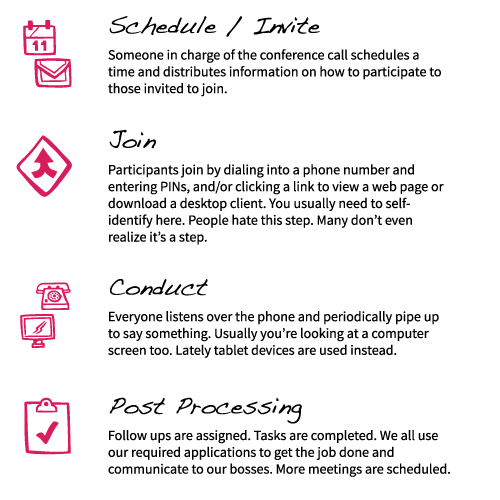
Most people use another tool for stage one, like a calendar application, email, or unstructured communication (instant message). Scheduling is a hassle and often the source of wasted time. Key outcomes are syncing time zones, providing local international dial-in numbers, and the right call to action on how to join.

Joining is the second stage and is over looked by almost every vendor. I find this ironic because it’s also the single largest source of frustration with conference calls. Take a moment to contemplate everything that can go wrong:

  • Phone number and join link is old because the host had to recreate the meeting or accidentally created multiple meetings.
  • Participant doesn’t have a local dial-in number.
  • People generally need to download something (we’ve all used WebEx or GoToMeeting, right?), and the process is slow. Plus often the systems are problematic. IT administrators may prevent the downloading of a Java client, or lock down an IP range.
  • People are late. People arrive early.
  • Someone misses the call entirely.
  • Participants might need to remember authentication, and who likes to remember usernames/passwords?

It’s a full process unto itself and deserving of a separate stage. I find it surprising and exhausting how poorly this stage is designed, resulting in calls starting out negatively before anyone even speaks. People tend to be in a bad mood entering a conversation because of this stage.

The third stage is the actual meeting. Other products tend to focus on this stage. You got interactive white boards, call management widgets, screen sharing, social media plugins, LinkedIn profiles, liking-sharing-posting-chatting-talking … you name it. All in the name of making the call “more useful” by making it more interactive. Sometimes I feel it’s actually making a conversation more distracting. Many users resent the tools found during this stage.

The fourth stage is a never-ending ray extending out from the moment the call ends. Products tend to not associate this stage with a conference calling application, but it is a vital portion. Users create follow ups, assign tasks, share files, and log information in systems—like a CRM, ATS, or Basecamp.

I see this stage as the connector to other jobs participants need to do. The fourth stage is a launching point to other actions. However, it is important to remember Des Traynor’s point about staying true to what your product is meant to do. You don’t want to extend beyond that line. For example, it’s difficult sometimes to remember that Symposia is not a calendar scheduling tool or meant to be a framework for to-do’s, but is a conference calling application.

It has helped me to think of a conference call like a single line that has a beginning but no ending, then cutting that line into four sections.
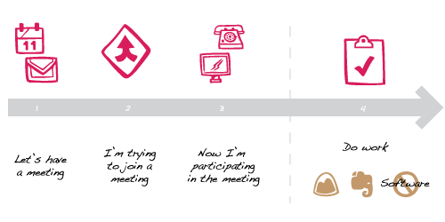
I see the Post-Processing phase as the most fertile area for innovation. Users might come back to the call at a later point. They might need to extract context to a follow up. We have yet to fully understand the full value, but the possibilities for aiding specific jobs to be done are rich.

It has helped us to think about a conference call in four stages. Addressing each stage and targetting features and flows that focus on enabling the successful completion of the job to be done within those stages has made the product more useful overall.

Navigating Databases Visually

Data navigation has few standard experiences. Generally, you browse data in list or table formats. Rows, columns, filters, ascending, descending, bullets, margin, zebra stripes, borders—you know the drill.

Part of the interest behind the Nodal project was to push our understanding of how to browse data. We built it under the simple question, “What if data could be more interactive?”

The D3 JavaScript library and work that Mike Bostock has been doing is truly inspiring. If you don’t know Mike, he splits time at Square, one of the most admirable growth startups in recent years, and the NY Times. He is responsible for many of the interactive graphs you see on nytimes.com every week. My favorite was this one leading up to the election.

Matt, Jesse and I looked through the type of graphs D3 provides out of the box, as Nodal was to be a Hello World experiment. We stumbled upon an example of a node graph that used physics and thought What if these nodes were people? We brainstormed until we landed on the idea of letting GitHub users explore their network graph.

This is not novel, we acknowledge that. It’s nothing new. But what comes next became intriguing to us.

See, when you have hundreds of nodes representing people and connect them based on a relationship, filters become increasingly more powerful.

For example, let’s say I’m looking at a graph of 1,000 StackOverflow users. I want to filter to just those who are considered Python experts. Trivial, I know, but seeing the results in an interactive network graph compared to a table is a fascinatingly different experience because interactivity is richer. Now let’s say I’m looking at that grouping of Python experts. I find a few I want to contact and drag their node over to a side. When I have my group, I simply drag to select them and cast a command via a context menu.

In the end, Nodal is just a simple experiment that isn’t anything too mind-blowing. But it sparked curiosity. What interface innovations can be done to make navigating a data set more intuitive? Is there a framework that can work across any type of data set? Which heuristics are better than others? And so on.

We are thinking of expanding Nodal to different social networks and types of data sets. Each time we anticipate learning something new.

Building Responsive Layouts As You Go

With each passing month, the priority to provide responsive layouts grows. Every new project I find myself bumping responsive views for mobile devices higher on the priority list, which means I’ve had the chance to evolve my approach.

Lately my favorite approach is to build responsive device-based layouts at the same time I build the normal desktop layout. I focus on a singular view or flow, and design each of the responsive layouts at that point in time. This is in contrast to building the entire application for one specific layout type (e.g. desktop min-width 1024px) then starting over again with the next layout type, and so on.

For example, I will take the login process and design/build all responsive layouts at the same moment before I move on to the reset password flow.

My main reasoning is catalyst. It forces me to think of responsive options and build them right away instead of telling myself I’ll come back to it. I do come back—I’m not lazy per se—but I tend to forget some of the deep thoughts and learning moments I had when designing the first layout option.

But I admit that may not be the optimal reason to decide on a responsive approach. I’m eager to learn more and watch my perspective evolve. So far my latest projects have been of the personal nature. I have yet to approach responsive layout design at a production level. My perspective may change due to code optimization concerns and speed of development. My colleagues might have insights or needs that alter my approach too. Perhaps after a while, I’ll discover something better.

Pixel Perfect Graphics in Illustrator

Over the years I’ve relied on Photoshop too much. It made more sense for the web graphics I would create. Illustrator has these concepts that never made sense to me, relatively speaking, like color management, snapping, or shape selection.

Granted, Photoshop has some problems of its own, most noticeably the poor font management and lack of reliable alignment tools. But I’ve learned to work around them like I’m sure Illustrator pros have their work arounds.

Lately, the poor font treatment in Photoshop has driven me to explore more with Illustrator. One day I noticed an annoyance while exporting images for the web. They would often be blurry! Crisp, anti-aliased lines would be blurry. In Photoshop it’s easy to tighten up aliasing. This is an example of a shape where one line is between two pixels. Notice how there is an aliased edge?

I later learned that the dimensions of the vector file in Illustrator are important. If you aren’t structuring all your lines to be exactly on the closest pixel, you’re going to get the aliasing like above. In this image, note how my edge was not lined up perfectly with the 56px guide.

There are other preference tweaks you can do to combat exported blurriness. I found this article by Tony Thomas to be the most thorough.

Customizing X-Axis With Ordinal Graphs in D3

Within D3.js, you can customize axises fairly effortlessly by using the SVG Axis methods. I found them to be ineffective when trying to format the X axis for a stacked bar graph, however. I later realized it was because the SVG Axis library will not target ordinal scales, but only linear scales.

While scouring Stack Overflow, Google Groups, and whatever my search queries would produce, I found nothing but custom work-arounds. So Matt Stockton and I had to come up with our own. We went with targetting the .text() method of an SVG element. By accessing the data (d) and loop iteration (i), we could write a heuristic that customizes frequency and format similar to SVG Axis.

Often times a heuristic like that is an excellent work around.

Hacking Communication Theory

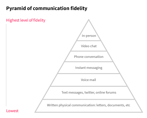
One way to look at communication is through the prism of fidelity. In this simple image, I have listed out the most common modes of communication in our present society. It is ordered based on highest to lowest. Fidelity is defined as how messages are sent and received. With more methods, more information is transmitted from sender to receiver—and perhaps reciprocating through a feedback loop.

A simple example. I’m talking to my friend and say, “Sounds great.”

Over Twitter, that could be taken as literal.

But in person, there are many extra methods beyond just the words being spoken. Also present we find vocal nuance (I had a short tone, downward inflection, spoke very fast, and was quiet), mannerisms (I was fidgeting and tapping my foot), eye contact (my eyes were looking away, almost like I was distracted), facial recognition (I winced).

The two different modes tell separate stories. Via chat, I sound excited. In person, it’s obvious I’m annoyed.

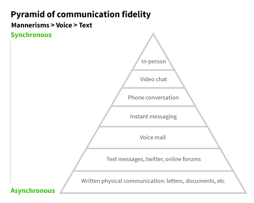
Some patterns emerge. First, mannerisms are more important than voice, which is more important than text (or words). Second, Synchronous is more important than asynchronous. With that in mind, the chart could be redrawn to look like this.

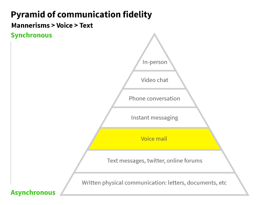
Voicemail is an interesting layer. It clearly has more fidelity than similar asynchronous textual communication. But it suffers in utility by comparison. It’s only available, generally speaking, on your individual (smart)phone handset. It doesn’t play well with other applications we use day-to-day, like email. It’s basically locked in a jail.

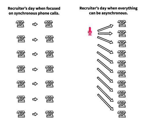
But there are areas of business that enage with voice every day. Voicemail is ineffective, but they must use voice, so they are forced to use synchronous phone calls. Unfortunately, they lose the common productivity gains provided in the text world. They key is, though, they don’t actually need a live phone call. They just need the fidelity of the voice.

So the Voicemail layer is often overlooked and criminally underused.

Thinking about Jobs To Be Done while innovating this layer of communication theory has been the goal of HarQen. We first started with Voice Advantage, an automated interview/screening tool for busy HR and Staffing professionals. We found that staffing firms would receive thousands of resumes and applications for a single job opening in one week. Often a single recruiter would be in charge! The process was normally:

  1. Gather all resumes and applicants into an Applicant Tracking System
  2. Put resumes into three piles: A, B, and C.
  3. A’s would be called on (“smile and dial!”)
  4. C’s were discarded
  5. B’s were a mystical “maybe” pile were there might be some gems, but who knows
  6. The recruiter would waste her entire week calling pile A, and eventually make an offer to a candidate and move on

Many innovations are making this process easier for all. The way job boards funnel into the ATSes is a big example. Our novel idea, though, was targetted on the Smile And Dial. Just think of these problems:

  • The recruiter is saying the same thing almost every phone call; a massive waste of time.
  • Sometimes calls would take 30 minutes, but the recruiter might know 5 minutes in that this candidate isn’t a fit. This is called a “courtesy interview”.
  • Scheduling hassles. Lots and lots of scheduling hassles. Even more wasted time.

So the thought became What if we could convert the Smile And Dial procedure into an asynchronous format? The recruiter would only need to record her questions once, and then could listen to each candidate’s answers.

This break through has been a success. It has been so well received that it created an industry: virtual interviewing. Many companies are doing great things in this space now, although most are focusing on video interviews. We consciously stayed with voice. We felt more candidates had access to a phone, and the workflow would be considerably easier for recruiters and candidates alike. Going back to our pyramid, our hypothesis was that bumping up from the “phone call” layer to the “video chat” layer wasn’t as much of a requirement for recruiters as they thought. And the technical and user experience gains with keeping it simple with the phone made the most sense. It was the best intersection of value creation.

This mode of thinking is very exciting to me. Continuing to discover communication problems and solving them by rethinking what’s possible layer-by-layer in the pyramid is a wonderful day job.

Double-Sized Graphics for Mobile Crispness

While working on the Dayda project, I noticed that my images weren’t very crisp on mobile browsers. When researching, I discovered that if you double the size but state the normal width/height via CSS or inline, you’ll achieve greater clarity. Obviously a concern is bandwidth, but if you can afford it, it’s worth doing.

Example Dayda logo in mobile Safari at standard size:

The same image but doubled in size:

Time As The Ultimate Event Handler

Data is the future, I hear. Well, if it’s not already the present.

How is data created? As the Merovingian would say, something must be the cause for its effect.

In the digital world, data is generated through event handlers, or some kind of lever. That lever is an action of some sort. Mostly it’s a human doing something physical like clicking a mouse button or snapping a picture on a camera. Events can trigger other events, but there’s always a root.

Eventually, the ultimate event handler will be time. Every millisecond data will be generated everywhere, monitoring everything we do.

I can imagine a future were every millisecond data is being gathered. Our clothes, our objects, our digital lives—we’re going to be monitored and every second data will be gathered about us.

Time will eventually be the ultimate event handler.