Over the years I’ve relied on Photoshop too much. It made more sense for the web graphics I would create. Illustrator has these concepts that never made sense to me, relatively speaking, like color management, snapping, or shape selection.
Granted, Photoshop has some problems of its own, most noticeably the poor font management and lack of reliable alignment tools. But I’ve learned to work around them like I’m sure Illustrator pros have their work arounds.
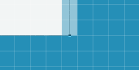
Lately, the poor font treatment in Photoshop has driven me to explore more with Illustrator. One day I noticed an annoyance while exporting images for the web. They would often be blurry! Crisp, anti-aliased lines would be blurry. In Photoshop it’s easy to tighten up aliasing. This is an example of a shape where one line is between two pixels. Notice how there is an aliased edge?

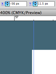
I later learned that the dimensions of the vector file in Illustrator are important. If you aren’t structuring all your lines to be exactly on the closest pixel, you’re going to get the aliasing like above. In this image, note how my edge was not lined up perfectly with the 56px guide.

There are other preference tweaks you can do to combat exported blurriness. I found this article by Tony Thomas to be the most thorough.
